
Brand creation for a takeaway coffee concept
Urban consumers are craving better coffee: fast, high-quality, and more natural.
This project responds with a premium, on-the-go coffee — made for those who want convenience without compromising on taste or values.
“
insight
I’d love to grab a coffee before heading out to get through the day — but I’m either too lazy or just don’t have the time to make it
brand territory
Attitude in every sip
We offer a coffee experience made for a fast-paced, conscious lifestyle — combining convenience, quality, and a commitment to sustainability.
Every sip inspires young people to face the day with energy, purpose, and attitude.
Our place in the market
We’re the perfect match for those who seek both convenience and quality in every sip — helping them take on the day with a positive attitude, fueled by a more delicious and sustainable world.
Empowerment
Authenticity
No fun without responsibility
Joy-fueled energy
Our core values
How we show up
That friend who’s always full of energy and good vibes — the one who lifts everyone up and inspires you to be your best. No matter the challenge, they stay positive and ready for whatever comes next.
What drives us
With every sip, we help build a more sustainable world — offering convenience, quality, and an extra boost of energy for our consumers.
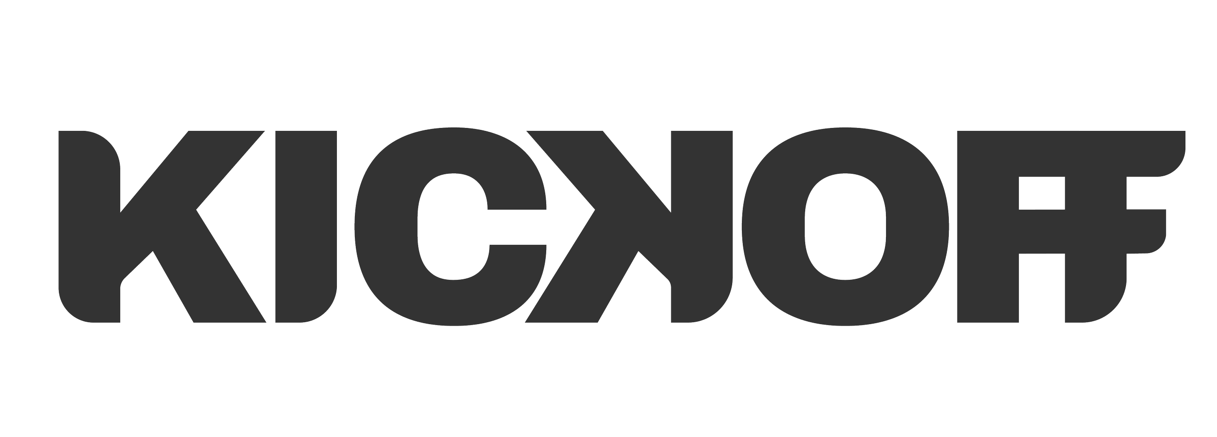
naming
The name should align with the brand’s essence: something fast and made for workers.
There’s a clear need to create a narrative that connects both ideas — speed and ritual.
Time is key here — immediacy matters — but so does the everyday ritual that surrounds coffee.

In business and work contexts, “kickoff” refers to the meeting held at the start of a project, with the goal of aligning the entire team around a shared concept — a sort of starting point.
visual identity

Created using the “Archivo Black” typeface, with custom adjustments that reflect a brand that feels accessible, yet bold.
Typography
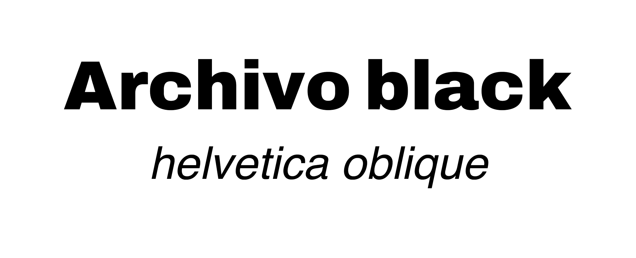
Archivo Black conveys strength and modernity. Its bold presence makes a strong visual impact while remaining highly legible.
Helvetica Oblique adds a subtle sense of motion and elegance. Its clean lines and simplicity create the perfect balance with the rest of the system.
color palette
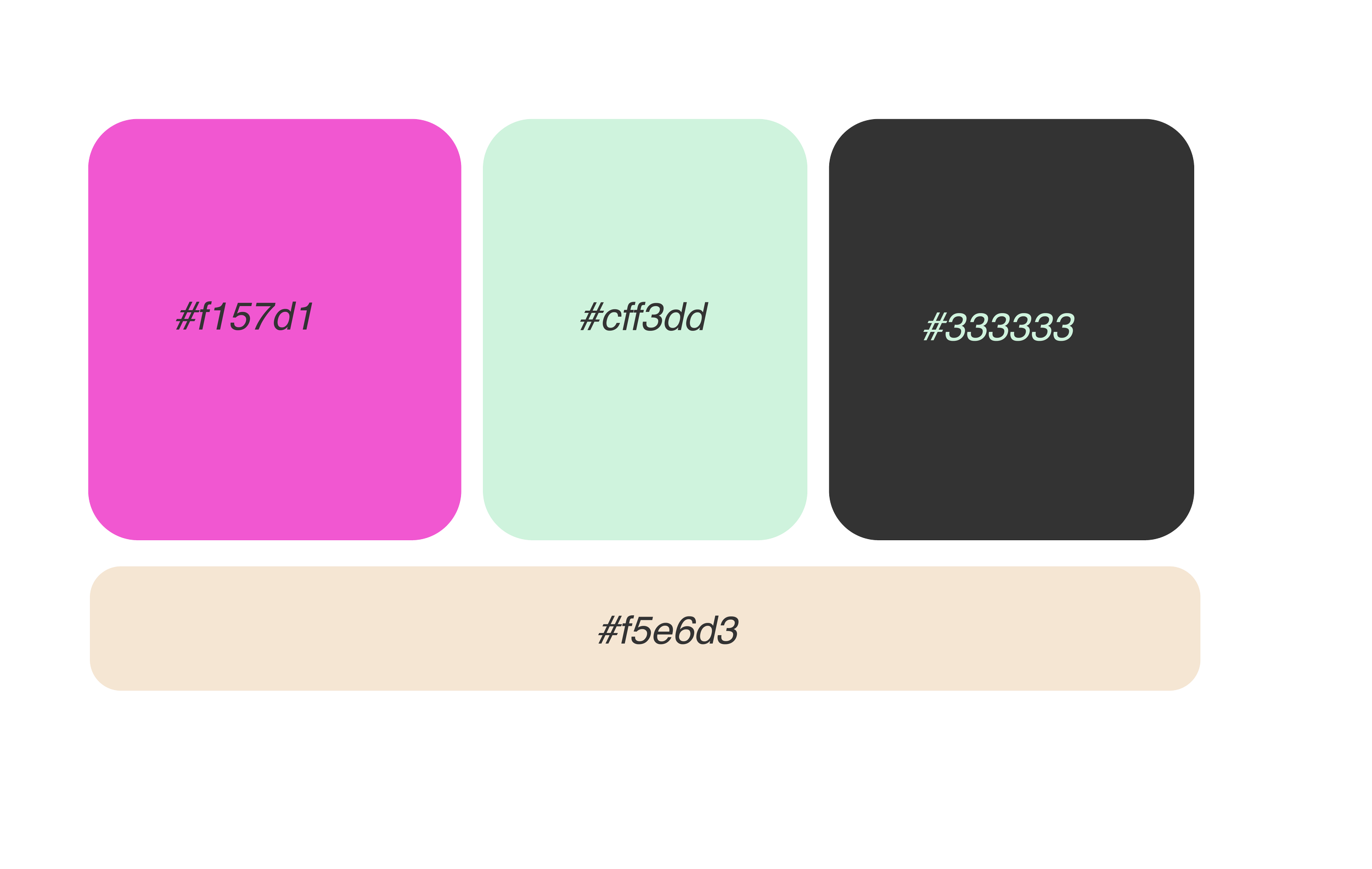
Mint green: evokes freshness and is often associated with young, hardworking people. Its softness also makes the brand feel more approachable.
Vibrant pink: brings contrast and energy — just like coffee. It’s also a color strongly linked to creativity.
Dark grey & beige: act as neutral tones that balance the palette, adding visual harmony and versatility.
packaging
visual style
bringing the brand to life
Coworking spaces in the heart of Spain’s major cities.
Meeting rooms, shared desks for two — everything designed so users feel they have everything they need to work at their best.
Even the coffee.